When designing a custom t-shirt, color is often the first thing people notice, even before they read the text or understand the graphic. Color psychology plays a massive role in consumer behavior and brand perception. Here is why you need to choose your palette carefully.
What is Color Psychology?
Color psychology is the study of how colors affect human emotions and behavior. Different colors evoke different feelings, and leveraging this can make your custom apparel much more appealing to your target audience.
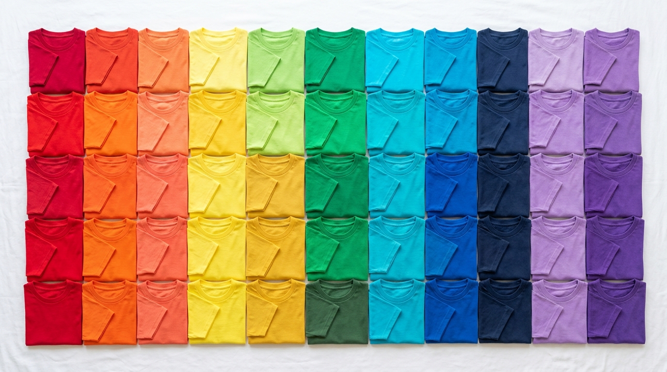
Common Colors and Their Meanings
- Red: Evokes excitement, passion, and urgency. It’s an attention-grabber, perfect for bold statements or sales promotions.
- Blue: Communicates trust, calm, and professionalism. Often used by corporate brands, tech companies, and for uniforms.
- Green: Associated with nature, health, and growth. Ideal for eco-friendly brands, outdoor apparel, or wellness products.
- Yellow: Represents happiness, optimism, and youthfulness. Great for playful, energetic designs, but use it carefully as it can be overwhelming.
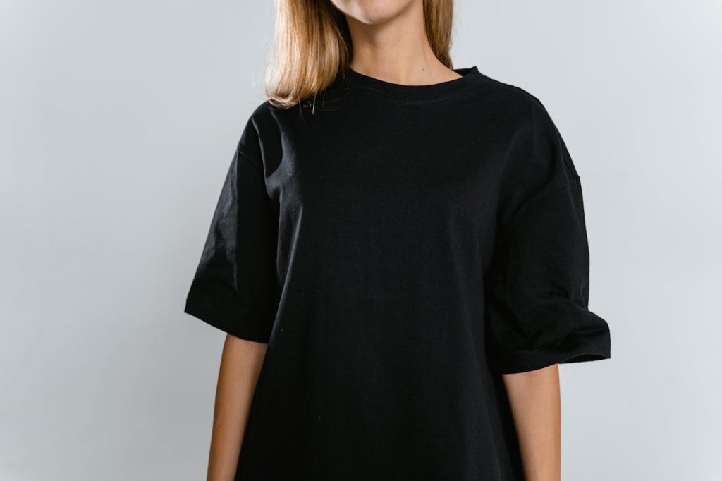
- Black: Signifies luxury, power, and sophistication. It’s the most popular t-shirt color globally because it’s slimming, versatile, and makes lighter graphics pop.
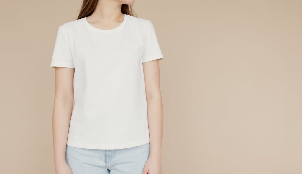
- White: Conveys purity, cleanliness, and simplicity. It offers the best canvas for highly detailed, full-color DTG prints.
Creating Contrast
Beyond the emotion of the color itself, contrast is vital for readability. If you are printing text, ensure it stands out against the shirt color. A navy blue graphic on a black shirt will get lost, whereas a bright yellow graphic on that same black shirt will immediately draw the eye.
Next time you mock up a design, try it on three different colored backgrounds. You might be surprised by how the ‘feel’ of the shirt completely transforms!